People are creatures of habit. Leaving familiar, comfortable environments like Windows 7 or Gmail’s classic view is the last thing anybody is usually interested in doing, so we put it off as long as possible before having change thrust upon us. Sometimes, we often find the change isn’t as bad as we’ve made it out to be, and feel a little silly for building it up to be the end of the world as we knew it.
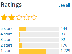
Other times, you get a situation like WordPress’ new visual editor Gutenberg, where the response continues to be overwhelmingly negative since the major push to use it in 2018 (Photo is from February 2019, but can be clicked to see current ratings).
I’ll be the first to admit that after installing the Gutenberg plugin, I saw how dramatically different it was from the classic editor and noped right out of dealing with it. I had clients to work with and content to produce, and neither needed nor wanted a different way of managing WordPress content. When it fully replaced the classic editor on December 6th’s release of WordPress 5.0, I installed the classic editor plugin to keep business running as usual.
I did this for a couple reasons. The first was that Gutenberg has some compatibility issues with older tools, causing a percentage of websites using them to be wiped out or unusable. While the sites I work with were not in danger of this, I wasn’t in a hurry to take chances with something as important as uptime or custom content – especially during the holiday season.
My other reason for doing this was due to the fact Gutenberg was pretty unstable for a core functionality upon its release. That’s unacceptable on its own, and inflicting that upon business owners during one of their busiest times of the year was completely inexcusable. I elected to give WordPress a couple months to get the majority of their Gutenberg hiccups worked out before I started working with or reviewing it in any capacity.
Now that we’ve passed that threshold, I’ve spent quite a bit of time working with Gutenberg in a clean WordPress installation. There are things it does better than the classic editor, things it does less effectively, and others that are simply different. I’ll be looking at these areas through the lens of user experience so you can decide whether Gutenberg is really as bad as popular opinion says for yourself.
Jump ahead to:
So what is Gutenberg exactly?
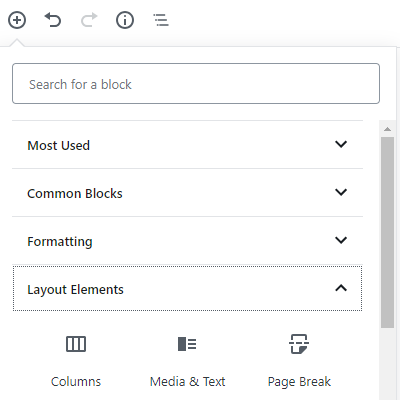
WordPress’ classic page and post editor looks a lot like a word processing program. You have an area where you can type things in and a set of editing tools directly above it to format pages and posts the way you’d like with fonts, images, lists, colors, etc. Gutenberg takes a step closer toward being a WYSIWYG experience, utilizing a block system with a variety of different features you can use to build pages.
This is a pretty radical change from what we’re used to getting from WordPress, and their team fortunately understands this. A plugin that replaces Gutenberg’s editor with the classic WordPress editor is available and will be supported through the end of 2021. But what about after then? The overwhelming opinion is that Gutenberg just isn’t up to snuff, but WordPress runs 30% of the Internet.
Rebuilding that many websites would be an undertaking to say the least. Luckily, there’s a better way that’s in place if we need it.
Scott Bowler, a concerned member of the millions that make up the WordPress community, has taken the initiative to get ahead of this issue and launched a fork to WordPress called ClassicPress, which focuses on keeping the classic experience without Gutenberg. This includes maintaining community involvement, which seems to have gone by the wayside in order for the powers that be to force Gutenberg into place.
It’s still too early to determine whether this fork will become the future of WordPress, a competitor, or forgotten, but it’s also good to know that it’s there as web developers and business owners move forward in this new world WordPress has thrust upon us.
Where did Gutenberg move all my settings to?
This is almost certainly the first question you asked when initially looking at Gutenberg, and it’s certainly a reasonable one. While most of them are still present, they’ve either moved to new locations or are now only affiliated with specific blocks.
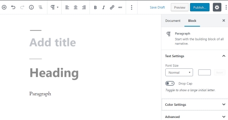 Starting off, your text editor has been broken into two pieces for the Paragraph blocks. Basic formatting tools are now found at the top of your page (alignments, bolding, links, etc.) while a few other tools (colors, font sizes) are found in the block settings to the right. Block settings affect the entire block you’re working in, meaning that you cannot color or adjust the fonts of specific words within a block.
Definitely a step backward.
Observant readers probably noticed I specified the Paragraph block a moment ago. Unfortunately, the options you get for each block vary even when they’re in the same family. For example, Quote, Header, and List blocks all lack text coloration options despite all being similar in nature to the Paragraph blocks. While you can get around this flaw using the Classic block (more on this later), this feels like another pretty severe step backward.
Speaking of missing settings, the tabs for Screen Options and Help are also gone from the upper right hand corner of Gutenberg. These were helpful for arranging your editing pages and explaining what some of your tools did. WordPress isn’t bringing them back either – despite several reasonable attempts to explain why removing these was not in a user’s best interest.
Not all of Gutenberg’s setting changes were bad though. Moving the page’s permalink to join the rest of your page settings on the right side of the editor makes complete sense, as does moving the post excerpt and discussion boxes to join it. This allows most extra features added by your plugins to run the show below your post editor, which makes it much easier to determine which tools are part of WordPress and which are not – especially if you can’t get a hold of your developer.
What other benefits does Gutenberg offer the average WordPress user?
Arguably the best feature Gutenberg brings to the table is simplicity. This simplicity does not come from the block system itself, but from the blocks in Gutenberg’s toy box. They serve to fill in a few gaps that were fairly problematic for a lot of WordPress users using the classic editor because of the need for code or a plugin to implement them. A few examples of these include:
- Columns
- Image galleries
- Media and text pairing
- Tables
- Social media embedding
- Video embedding
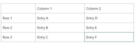
None of these features were impossible for those with reasonable HTML skills or an aptitude for searching Google, but they were needlessly cumbersome and took several minutes at minimum in the classic editor. Anyone who has had to put a table into a post can especially appreciate the frustration I’m speaking of and is probably thrilled that the above table took maybe 30 seconds to create in Gutenberg.
That said, I would have been satisfied with an additional tab of buttons in the classic editor that were specifically geared toward making these particular features easier to implement. Making WordPress accessible is a noble goal that we can all get behind, but I simply don’t see why the wheel had to be reinvented to do so – especially considering the headaches Gutenberg has introduced.
Where else does Gutenberg’s design come up short?
Block systems have never been my preferred medium for designing a website because of two key flaws they usually exhibit – rigidity and their tendency to compartmentalize every part of a page. While Gutenberg’s blocks are surprisingly flexible, its interface fell headfirst into the other trap of block builders.
You’re going to run into this problem in two key areas. The first occurs in the visual editor, where you used to have access to all your formatting tools in one package. One could compare it to a TV dinner, except classic WordPress is of considerably higher quality. Gutenberg makes you add every ingredient for your page or post as individual blocks. Need another heading? Add a block. Text? Block. Bulleted list? Take a wild guess.
You’re basically cooking from scratch until you have a recipe that works for the majority of your posts. This takes a lot longer, but was implemented in the interest of quality for Google’s SEO algorithms in addition to the alleged ease of use. Yoast explains that Gutenberg’s blocks make it easier for Google to read pages with structured data by breaking them up into sections.
In theory, this improves your ability to showcase structured data across your page, target multiple keywords per page, and show up in rich results.
Since Google decided to emphasize schema and technical SEO in a way that hadn’t been seen for years in 2018, there is merit in trying to stay ahead of the curve. That being said, the results of these changes are inconclusive (leaning negligible) at this point. Frankly, I find Gutenberg’s formatting to be pointlessly meticulous and a tremendous waste of my time, but that could easily change as more results and updates surface.
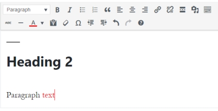
Fortunately, there is a block within Gutenberg that delivers the classic rich text editor experience we enjoyed prior to WordPress 5.0. Basic page and post conversions to and from Gutenberg are no issue as a result, and you can also create new pages and posts with it to help ease your transition.
My other beef with Gutenberg’s compartmentalization ties in with the code editor. Classic WordPress allowed you to add a handful of functions where your rich text editor options would normally be, making sure you closed functions properly or had a cheat sheet for basics if you were less familiar with the ins and outs of HTML.
These are not only gone in Gutenberg, but your button for adding blocks is also disabled while in the code editor. This involves a lot of jumping back and forth between the visual and code editors unless you take the time to memorize all the code for WordPress’ different blocks so you can add them by hand.
While this will be a far less common issue for the average user, those who are used to customizing with code in WordPress are simply left wondering why the developers felt the need to create such a pointless hurdle. One can only hope they decide to correct this in a future release.
You lost me at “Gutenberg”. Are you able to design and improve my website?
You bet. If you’re just starting out online, we can build you a modern website that puts your best foot forward. For those who have already established their online presence, we also offer SEO audits that analyze your current strengths and weaknesses, then craft a plan of action that is tailored to help you pull ahead of your competition. Just swing by our Contact page or call 319-229-5225 to get started!

Braden is one of the founders of Midwest Websites, and has been professionally writing and developing websites for over 7 years. His blog posts often take an experience from his life and showcase lessons from it to help you maximize online presence for your business.

