![By Samarkandiy [CC BY-SA 4.0 (https://creativecommons.org/licenses/by-sa/4.0)], from Wikimedia Commons Squarespace logo](https://midwestwebsites.com/wp-content/uploads/2018/03/Squarespace_logo-1.png)
They also only offer paid plans for people who seek to build a website through them. While this is a bit different from the traditional freemium model, Squarespace aims to deliver the best of both worlds by letting you test their environment for up to two weeks at no charge before you commit.
This is an ideal setup for a WYSIWYG in my opinion, as it suggests a degree of quality that providers like Wix and Weebly simply don’t bring to the table right now. As a result, our primary hope is that the common flaws WYSIWYGs normally present will be far less prominent than usual.
In order to test whether you should consider this investment a sound one, we started a trial at squarespace.com and used our experience to rank Squarespace’s environment on a scale from 0 to 10. As with any of our reviews, a platform scoring a 0 renders it completely useless for business websites and a 10 puts it on an equal standing with WordPress.
To determine this score, we began by asking 5 questions that use the same scale as the overall rating. Here’s a refresher on what they are:
- How limited is our ability to control the website?
- How easily can we access our hosting platform?
- Do we exclusively own our content?
- Do we have everything we need for SEO?
- How easily can I integrate third party add-ons?
Once their results were averaged, we reviewed unique pros and cons that didn’t really fit within the overall criteria, then added or subtracted from the average accordingly. Ready to see whether our expectations matched reality?
Jump ahead to:
How limited is Squarespace’s website control? Rating – 8/10
When you sign up to build a new Squarespace website, you begin by choosing a template. Your template options are broken into industry categories, but many appear in more than category, making it look like there are more choices than are actually present. There are only 90 active templates as of October 2018.
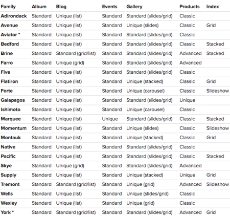 While this looks like a lot of options on paper, you can actually break Squarespace’s selection down to about 21 choices between the template family and feature guides, meaning you really don’t have all that much to sort through. In all honesty, I wish they’d just give these to you from the start to reduce confusion and show what you’ll actually receive with each theme.
After previewing different options and sorting through the available features, I started my journey with the York template. It took me all of one click to find my first paywall, so I thought I was going to be in for a rough time. Fortunately, the popup I received was merely alerting me to the fact that commerce is a premium feature, so I was still able to go in and play around with the different tools and settings.
Quite the improvement from my Weebly experience.
Squarespace’s commerce tools represent an ideal setup for your business to build an online store. Menus are well organized, allowing you to set up products and their variations, create robust descriptions for them, manage existing customers, offer discounts, keep track of orders, and connect social media platforms.
Once you connect a payment processor, you can also adjust your store’s currency. While this is just fine for smaller local markets, larger markets that cover multiple countries are also limited to the single currency you select. This can be a major dealbreaker when considering the potential for customer confusion and conversion charges, so you’ll want to consider your company’s current position and future goals before you start entering your products.

E-commerce doesn’t just thrive on products though; you also need to build a functional site alongside them. Squarespace’s design tools use the normally stifling block system WYSIWYGs are notorious for, but they execute this idea much more effectively by giving you two key components alongside them: options and flexibility.
Your block options are broken up into a few categories to make them easier to navigate, including basics like text, images, and videos, image layouts, galleries, charts, social media, and more. There are also some premium buttons for things like restaurant menus, online scheduling, and Amazon product placement. As with the commerce area, most of these premium features actually operate during the trial, so you can assess their usefulness before paying Squarespace so much as a penny.
The best surprise was how designer-friendly the blocks are compared to environments like Weebly. I know it looks like I’m picking on them in this section, but when you pit Weebly’s aggravating interface against Squarespace’s abilities to resize blocks, easily place them where you intend them to go, and move them if you wish to try them in another spot, it’s like seeing all my wishes from that platform review being brought to life.
Sadly, this flexibility does not extend to mobile and tablet views. I would have preferred a separate mobile editor like those you’d find with Wix or Duda, as entrusting an automatic mobile configuration is akin to playing Russian roulette with your layout, but between their advanced mobile styles for most templates and comprehensive guide for keeping your site mobile-friendly, Squarespace has invested some serious effort to help you minimize your risks.
If you find your original template to be lacking after spending some time with it in the design editor, you’ll be happy to learn that changing templates is fully possible within Squarespace’s environment. I don’t recommend trying to wing it without this cheatsheet though – the process is not especially intuitive if you intend to preserve your content between templates.
Fortunately, you also don’t have to go into a new template blind. You can see how your content will transition prior to confirming your change, ensuring you aren’t going to be handed a disaster that will take more time to fix than simply starting from scratch.
Our last item of note here is the blogging platform, which has been clearly modeled after WordPress. Categories, tags, the ability to save drafts, and the ability to have multiple contributors were pleasant surprises. My favorite feature has to be the ability to use Squarespace’s block system for posts though. Everything you need to create and arrange top-quality posts is present within it, lowering the learning curve and making the experience pleasant for new and experienced bloggers alike.
Squarespace has also created a short tutorial series showing how to create an online store through their platform. You can check out the first in their 4 episode series below.
How accessible is Squarespace’s hosting platform? Rating – 4/10
SSH is unavailable, and SFTP has been turned off for the average user. Developers who seek more flexibility from a Business or Commerce plan are in luck though, as Squarespace has created an option for this in the form of Developer Mode. While this does open up SFTP access, there are a few other pros and cons you’ll want to weigh before diving in and customizing your website’s code.
First, you’ll want to know what you’re getting into with Developer Mode. Basically, it opens up access to your template’s HTML, CSS, and JavaScript so you can modify pretty much any aspect of your template you’d like. This freedom does not extend to Squarespace’s blocks or other proprietary editing tools, but is better than nothing. You may also use Git alongside or in place of SFTP to work with your site.
Developer Mode also gives you access to an API whose primary function is to help you automate certain elements of your site. While most of the examples Squarespace cites are more applicable to commerce websites, this can be a major time-saver with the right know-how and application.
Remember that Squarespace does reserve the right to modify their own code as well, which might occasionally create friction you’ll need to go in and fix on a moment’s notice. They also retain ownership rights to their templates, so you aren’t going to be able to piggyback on their work for use elsewhere. Totally makes sense, but there’s always someone who will try if it isn’t spelled out in the terms of use.

The next thing to keep in mind is that Developer Mode is not a substitute for backing up your website. Squarespace doesn’t really offer an ideal solution to fill that need either – their recommendation is to basically save original files and copy text/code to an offline location. Onsite backups aren’t an option either – once you save a change, it’s there to stay. This is especially critical to remember if you ever turn off Developer Mode, as doing so will wipe any code customization with no chance for retrieval later on.
I find this lack of backup options especially perplexing because Squarespace actually does have limited importing and exporting capabilities. Rather than being designed for use with the current version of their own sites, Squarespace has endeavored to allow easy importing and exporting to/from third parties like Shopify, Tumblr, Blogger, Big Cartel, and even WordPress! Exports from Squarespace will be in the form of an XML file while imports can use XMLs or CSVs.
While this can be great for moving pages, blog posts, images, and videos away from Squarespace and can cut down on the tedium of adding these and product data to a Squarespace site, there is a reasonable chance you’ll still run into hiccups with broken links, missing data, etc. Despite that, this feature represents a noble sentiment that I hope Squarespace improves and expands upon in the future.
The final point worth noting is that Squarespace expressly states that they run their main site on the same servers you do. That’s a pretty big vote of confidence in their hardware, so while you don’t have access to your server’s settings, I’m willing to grant Squarespace the benefit of the doubt when it comes to matters of managing traffic and optimizing performance.
I lowered this score from 5/10 to 4/10 during my October revisit due to Squarespace’s complete inability to integrate any sort of backup feature that works with version 7 of their platform.
How much of my content does Squarespace own? Rating – 3/10
Look, Squarespace. I am completely on board with you using your developer terms of use to protect what is yours. Nobody should be allowed to reverse engineer the work you put in to get where you are for the purpose of furthering their own gains elsewhere. So why, pray tell, do you not extend that same courtesy to your own customers?
You can’t just expect me to simply take you at face value in section 2.1 of your terms of use, which tells me anything I put up on Squarespace, including but not limited to text, pictures, video, and code remain mine, then immediately change your tune in section 2.2 by giving you free reign to do as you see fit with my content in the name of providing, promoting, protecting, and improving your services.
That single word is my primary issue with your terms, because it gives you power you aren’t entitled to if I manage to find a way to do something cool on your platform that is not dependent upon it. While this is fairly unlikely in my particular case, any developer using Developer Mode could easily find themselves exploited in this position. For consistency in my October revisit, I am lowering this score to 3/10 for everyone instead of splitting it between developers and users.
How unfriendly is Squarespace’s SEO design? Rating – 7/10
I’ve got to give credit where it’s due. When Squarespace does something well, they really excel at it. SEO is no exception, boasting easy access to meta titles, meta descriptions, custom URLs for the site and individual pages, SSL support, responsive designs, organized code, and redirect options.
You’ve got to be able to take the bad with the good though, and Squarespace’s blind spots are miles wide when viewed by the average user. Despite providing access to alt tags and header tags, their ease of use does not come anywhere close to fulfilling my expectations for a WYSIWYG.
For those who’d like a refresher, alt tags are words working behind the scenes of your images that tell search engines and the visually impaired what your pictures are showing. Header tags highly important titles on your page, which can be helpful for search engines that want to know what your pages are about and how to read them. Both matter for your SEO, so the average user needs to be able to access them with minimal hassle.
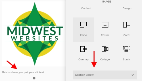
To manage your alt tags, I am going to start by referring you to this guide, which begins by showing you how to add them to image blocks.
Yes, you read and/or heard their guide correctly. You have to switch from your current layout to the Inline layout to add alt tags to every single image block. I know what you’re probably thinking, “That’s insane. Nobody would think to do this without finding their guide, not to mention the fact that this feature does not represent beneficial or intuitive design in any way.” And you’d be right.
Galleries and product images are managed a little better, simply requiring you to change the title of the image to update the alt text. Why not call a spade a spade and just say that this field is where alt text goes? You managed it for your cover pages, but couldn’t make it as transparent everywhere else? Give me a break!
Header tags are a mixed bag as well. For text blocks, their execution is just fine, granting you access to h1, h2, and h3 tags within your text editing options. Areas like your page banners (the big blocks of text toward the top of each of your pages that don’t use the block system) do not share this flexibility, and actually hold the settings for changing the automatically generated h1 tag Squarespace creates for you.
By default, this will match the name of your page, which isn’t going to be ideal for your SEO. This issue is compounded by the fact that this tag is in its own section that does not appear as text on your page, which could be construed by search engines like Google as a black hat SEO tactic. As if that wasn’t bad enough, you can’t actually get rid of this automatically generated tag without getting into Developer Mode.
While you can technically overcome these issues, it is unreasonable and irresponsible for Squarespace to assume the average user can use their current methods to do so. I’ve adjusted the rating from 6/10 to 7/10 during my October revisit, but this is only for the sake of consistency with my other reviews. Adjust to 6/10 if you use the automatically generated Squarespace URL instead of your own domain.
How easily can I integrate third party tools? Rating – 8/10
Developer Mode is going to be one of your primary tools for implementing HTML, CSS, and JavaScript improvements for your theme, but we pretty thoroughly discussed it and its API in an earlier section, so we’re going to focus on what you can do outside Developer Mode instead.
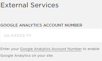
Fortunately, there’s still a lot to talk about even with that restriction! Your settings make integration with Google Analytics and the Amazon Associates program a breeze, giving you simple fields in the “External Services” section of your Advanced Settings. This section is also home to another critical feature for any site using contact forms – Google Recaptcha. Using it will help weed out spam bots, requiring users to enter a code before they can submit their form to you.
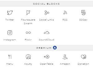
Don’t see what you need? There are more options beyond those pictured here.
Code can also be added to headers, footers, and certain blocks while Developer Mode is turned off in Business and Commerce plans, opening up options for users that just need one or two advanced features. Speaking of blocks, there are also several third party tools that are built in already, including social media options, industry tools like Opentable and Bandsintown, and general tools like Acuity scheduling and Zola wedding registries.
All in all, this is a nicely crafted package that is designed to give a good experience to average users and developers alike. Finding a platform that tries for this is rare in and of itself, and Squarespace strikes one of the best balances I’ve seen in the current WYSIWYG market. My advice is to take a little time to see what all you can do before you start trying to track down any sort of code – there are a lot of features to unpack once you get good at swapping between your blocks and your site settings.
The primary downside you are most likely to run into is the limitation of Squarespace’s platform itself. Code can take you a long way, but if you run into a need it, your blocks, or your site settings cannot solve, there’s no app store or other feature available that can cover for its absence. Not a huge deal in the grand scheme of WYSIWYGs, but definitely an area where WordPress has the edge over Squarespace.
What unique elements will I find with Squarespace? Overall Rating Adjustment: +.5 points
The value Squarespace brings to the table is undeniable and key to their current success.
Squarespace’s environment is simply overflowing with features. While I’ve done my best to point out all the highlights, there’s still a lot that simply has not been touched upon. Email marketing, on-site analytics, accounting tools, and password protected pages are just a small handful of the features I skipped over, so that should clarify the scope of what you receive by signing up with them.
Many of Squarespace’s partnerships also seem to be with less popular third parties. This isn’t necessarily a bad thing, but it does mean you might have some extra work ahead of you if you want to integrate widgets or other tools from companies like Constant Contact’s email marketing, Office 365’s scheduling tools, etc.
Setting up a Squarespace website is also going to be more of an investment than with providers like Wix, Weebly, and GoDaddy. I definitely think you get your money’s worth if you need everything Squarespace brings to the table, but if you need more you’ll be better off hiring a WordPress developer, and if you need less you’ll probably be better off spending less in exchange for the features you won’t use.
One last item to note is how excellent Squarespace’s help articles are. I never once had trouble finding an answer to a question that came up while working on their platform, and they have 24/7 phone support paired with that. While I think there are plenty of reasons for developers to steer clear, the average user is definitely going to be able to build a good looking site here. I’ve adjusted this rating from -.1 points to +.5 points during my October revisit as a result.
Overall Rating – 7/10
What you put into a website definitely influences what you get out of it. While this is the best template-driven environment we’ve reviewed to date, it isn’t perfect, and is certainly not a substitute for a well-constructed WordPress website. Swing by our store to see for yourself, or give us a call at 319-229-5225 today to have our designers build the top-notch website your business deserves!

Braden is one of the founders of Midwest Websites, and has been professionally writing and developing websites for over 7 years. His blog posts often take an experience from his life and showcase lessons from it to help you maximize online presence for your business.

