Welcome to the first in our series of platform reviews for template-driven web design providers. We’ll be starting with Wix, a popular, freemium WYSIWYG (What You See Is What You Get) platform that has been a big name in the market for the last decade.
Founded in 2006, this Israeli company has grown quite a bit from its humble beginnings as an Adobe Flash platform. Their adoption of HTML 5 came well ahead of many peers in 2012, and they’ve adopted over 110 million users as of 2017. Lately, their actions have suggested the goal of creating a fusion of WYSIWYG and WordPress, to the point where they’ve attempted to utilize the WordPress open source library for their platform.
This was the source of some controversy in 2016 due to the way GPL licenses operate, and was resolved by Wix taking a different development direction shortly thereafter.
I found this fascinating, as this conversation adds a new level of depth to the discussion we’re going to have in this review. When you consider how closely related certain elements were between Wix and WordPress, you can clearly tell some brainpower is being used to address the common issues shared by many WYSIWYG environments. Despite the sloppy execution outlined in this case, that is a noble goal.
In order to measure their current level of success, we established some review guidelines in our Free vs Premium post that are designed to show you specific details about individual providers like Wix. Each section scores their overall performance on a scale of 0-10, where 0 renders Wix unusable for your business and 10 puts it on par with WordPress’s excellence.
These five sections will be weighted evenly, then the average will be influenced by a final section about unique selling points or issues that would positively or negatively impact the overall score. To recap, our primary areas of focus are:
- Website design restrictions
- Hosting platform accessibility
- Content ownership claims
- SEO friendliness
- Third party code or tool integration
To outline each point properly, we started designing a brand new site at wix.com, and will be sharing our experience as we progress through each section of our review.
Jump ahead to:
How limited is Wix’s website control? Rating – 9/10
When starting the design of your first website, Wix offers you the choice of using its Artificial Design Intelligence (ADI) to choose a template for you or giving you the option to choose your own template. If you go with the ADI, you’ll be asked a series of short questions about your industry, business name, current website, and design style preference. Don’t read too much into the last one – it mostly relates to fonts.
After that, you can choose between 3 automatic template options or skip straight into the editor. Wix’s ADI is a pretty dumbed down version of their primary editor, breaking the site up into blocks that can be added, removed, or rearranged with limited customization in each block. It’s extremely easy to slap a generic website together, and if you don’t believe me, you can watch Wix showcase the features of their ADI below.
Bland websites don’t stand out in the business world, so I traded in the ADI for Wix’s template selection option at this point. Once chosen, it asks you about the type of website you’re planning to build, then takes you to a gallery where you can browse the templates that are available. You have a few hundred templates to browse, conveniently broken up into categories that are tailored toward different design goals and industries.
Amazingly, this is where Wix got its first strike against it during my original review. In order to change the category in Firefox’s private browsing mode, I had to click the category, then refresh the page before the new page would load. Fortunately, Chrome’s incognito browser worked normally, so I was able to continue without too much frustration, but programming that interacts poorly with a popular browser like Firefox is a terrible sign and frankly unacceptable.
I revisited this flaw in September 2018, and was pleased to find that someone agreed with me enough to correct this problem.
Once I selected a template and gained access to Wix’s full editor, I started to explore what it could do. You are able to drag and drop elements wherever you want them on a page (a rarity in today’s WYSIWYG market!), and add images, apps, and basic informational databases (their example video shows creation of a course catalog). This flexibility also extends to your mobile site, giving you complete, separate control of page elements for desktop and mobile users.
Wix’s apps and stock images come in a variety of free and premium flavors, giving you cost and design flexibility as you work. You can also upload your own media and use it on the page or even as your background. Less experienced users are advised to use this feature with care, as large images and video backgrounds can and will slow your website’s load time to a crawl.

I was pretty disappointed in Wix’s blogging tools when I found them. Don’t get me wrong, I’ve certainly worked with worse, but when you consider their similarities to and history with WordPress, I’m incredibly surprised by the lack of text editing options. A lot of what makes WordPress the best option as a blogging tool boils down to their unparalleled rich text editor.
While I acknowledge that Wix’s HTML coding tool can do most things a rich text editor can, it makes the process of writing and formatting a post so much longer than it should be. Nobody wants to code by hand when an alternative has buttons to manage that for you with a couple clicks. This became especially baffling when I realized that these same rich text editing options are present in the regular website editor.
Finally, if you want to use a new template for one of your Wix websites, you’ll be starting from scratch. Having the ability to create clones of your site so you have a published site and a work environment running simultaneously will help you transition, but this also seems like a needless hurdle for users to overcome when compared to WordPress.
Despite these flaws, it is clear that Wix’s design flexibility is still well above average among the top end of WYSIWYGs. Since I’m no longer seeing the errors I found in February, I have adjusted Wix’s original score from 7/10 to 9/10. For a visual primer of the full design process, the video below provides a basic illustration for the visual learners like me that are out there.
How accessible is Wix’s hosting platform? Rating – 2/10
No FTP or SSH access here. While this isn’t exactly shocking among WYSIWYGs, it does present a problem that is unique to their relationship with Shutterstock and their premium stock images. If you purchase an image or app through Wix, it stays with Wix.
While some browsers will let you save an image to your computer and certain third parties might allow you to carry data over to other platforms at their discretion, you won’t have any access to the original files. This isn’t really a surprise either – Wix did choose to keep their software proprietary after coming to blows with WordPress.

While the loss in image and data quality is unfortunate, you’re already facing the task of rebuilding your site when you move to a new provider.
There’s really no use in crying over spilled milk at that point, so I don’t see this issue as being a game-changing problem. I’d be remiss if I didn’t bring it up though.
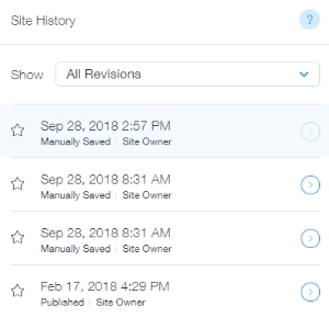
The lone point in Wix’s favor is their Site History feature, which allows you to go back to any saved version of your site with just a couple clicks.
Unfortunately, this feature does not include any automatic saves short of publishing your whole site, so it doesn’t stack up to GoDaddy’s GoCentral platform, and it’s tied to the site editor if your site gets deleted, so you have no recourse in a crisis either. While better than nothing, there’s definitely room to improve here.
How much of my content does Wix own? Rating – 6/10
There are some scary clauses in Wix’s terms of use that tread awfully close to the ground many companies stand on by saying they can use your content for their own ends. I’m going to point out a distinction that distinguishes Wix from many of its competitors in this category.
Section 2.2 discusses giving Wix the right to use or modify your content for use in their marketing. The fact that this right is being granted under restricted guidelines that do not open you up to reverse engineering or corporate plagiarism is a big deal. While they reserve the right to change their services and terms of use at any time, as of today I’d consider this a far better compromise than I’m used to seeing.
Now that we’ve covered the good, let’s look at the bad. As was mentioned earlier, you do lose anything you paid for through Wix should you move your website away from them. While I understand this being necessary for proprietary apps, I see no reason for this to apply to Shutterstock images you paid for. There are plenty of stock image providers out there that don’t restrict you to a single platform – go with one of them instead of paying directly through Wix.
I also don’t appreciate section 2.2 telling users they’re responsible for backing up their website content when the only easy way to do so is through Wix’s proprietary save feature. Until an external backup option is available, that’s just not a reasonable expectation to put solely on customers.
How unfriendly is Wix’s SEO design? Rating – 8/10
Meta titles, meta descriptions, headers, alt tags, mobile-friendliness, custom URLs, and an SSL certificate – all available and easy to manage. Wix has made some notable strides in the last couple years, but they still refuse to fix the issues with their bloated code. This bloat will tarnish even the best copy and SEO, rendering it difficult for search engines to read your website’s content and incurring their wrath and penalties as a result.

Wix does offer an option for URL redirection, but it’s limited to use within their environment. While this isn’t a particularly big deal for most users, this is another oddly specific restriction I just don’t understand. At the end of the day, a WYSIWYG runs on a server (and a fast one in this case), which is fully capable of external redirection. Opening that capability up isn’t going to cause any undue harm to your software or users, so why restrict it?
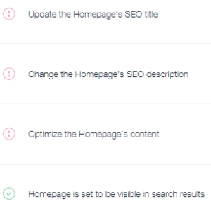
Despite this oddity, there is a real prize among all your available SEO tools we need to touch on as well. Wix”s SEO Wiz grants you access to tutorials and checklists for basic on-site SEO that are both easy to follow and make sense.
I’m fairly comfortable bumping this score up to an 8/10 instead of the original 6/10 due to how impressed I was with this offering – it caters well to users of all experience levels.
How easily can I integrate third party tools with Wix? Rating – 6/10
There are two key areas to focus on for this section – coding capability and apps. Each bring a lot to the table, so let’s start unpacking.
On-site coding capability begins with HTML code and Javascript, allowing things like Amazon affiliate links, Google Analytics, and interactive pages to be seamlessly integrated into your website. While more complex code is beyond Wix’s capabilities, they’ve designed a proprietary API to help shore up that weakness considerably.
This API primarily focuses on managing data, giving you the ability to retrieve data from third party locations, analyze information about your users’ browsing sessions, and have your site do specific things based on where your users arrived from. Naturally, you also have access to more basic options like creating databases, memberships, and commerce tools.
Advanced features like these are clearly a nod to more experienced web designers, and while they are not nearly as robust as MySQL databases, they represent a safe compromise that strikes a balance between security and function.
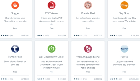
Wix is far from perfect out of the box, however, so they’ve created a second avenue to add rich features to your site using their app marketplace. While I’d like to say their WordPress is showing here, that would imply a standard of quality I have yet to see.

That’s a bold claim, so let me start with an example from earlier. Do you remember how disappointed I was by the blog earlier? It came from the app marketplace. Somehow, it managed to be the BEST option for adding this feature into your Wix website. Similar lackluster entries are common from both Wix and its partners, and for every app that is working correctly, another finds itself plagued by issues or missing basic features.
Vetting these releases for quality just doesn’t seem like it’s a priority. It’s like a marketing team is desperately directing developers to slap ideas together to see what sticks, and that’s just not how you run a successful marketplace.
Many of these apps also require a purchase to unlock a portion of their potential, turning muddy ground into a hazardous minefield for consumers.
WordPress has enough competition that submissions like that are simply weeded out as they fail to work with newer WordPress versions or perform up to expectations. If you don’t have that level of self-regulation, you’ve got to bite the bullet and invest in it yourself. Wix hasn’t.
I originally gave this section a score of 4/10, and am going to bump it up to 6/10 because of the API. Until the various marketplace fires are put out, I cannot consider giving a higher score.
What unique elements will I find with Wix? Rating Adjustment: -.7 points
When I first started playing with Wix’s WYSIWYG in February, I found broken links to Shutterstock images, terms and conditions for Wix’s apps, and in their help articles. I was understandably appalled by this then, and haven’t run into a single one during my September revisit. Give the person who decided a web company should look like they know what they’re doing in terms of web design and SEO a raise – you were clearly hard up for this keen insight Wix.
I still stand by my claim that having chronic issues with website and app links in this industry is completely indefensible. It’ll be a while before other users and I forget about this.
![By Matt Angorn (Shutterstock Vice President and Creative Director) & Lippincott Studio (Brand New website [1]) [Public domain], via Wikimedia Commons Shutterstock logo](https://midwestwebsites.com/wp-content/uploads/2018/02/Optimized-Shutterstock_2012_logo.jpg)
Is it really that hard to focus on doing right by customers?Next, let’s talk about Wix’s relationship with Shutterstock. I docked points in an earlier section, but the fact that you can’t integrate Shutterstock and Wix accounts with each other bears repeating. Purchases of professional stock images in each environment should be accessible from BOTH companies, not just the one you bought through. Having to pay for an image a second time should you choose to move away from Wix is just adding insult to injury.
We touched on another important point earlier in the review that I’d like to address now as well – you are allowed to build your site in ways that will greatly harm your site’s functionality and SEO. Flash, iframes, and giant page sizes are all function and SEO nightmares, and can be found in a variety of apps and core Wix editor features.
While you don’t have to use these tools, if you aren’t aware of what they are or how harmful they are to your website, they’ll quietly sabotage you and your reputation when Google comes to crawl your content. As insightful as the SEO Wiz is, it isn’t equipped to warn you about them either.
Do you find yourself in need of support for any of the fancy tools Wix offers? You’re probably in for a bumpy ride. Wix has limited hours if you want to call them, operating Monday-Friday from 5:00 AM to 5:00 PM PST, and only offers the ability to create tickets beyond these hours.
While Wix’s help center contains a wealth of useful documentation to supplement their mediocre hours, that isn’t a substitute for talking with someone – especially if you’re marketing to web design novices.
Overall rating: 5/10
Wix’s own worst enemy is itself. They’ve come so close to being a great platform, but they simply fall short because they aren’t fully focused on internal quality, which makes it unlikely that they’ll encourage that focus with their external partners. Until Wix organizes their priorities and fixes the flaws that are holding them back, any site you create with them will pay the price.
Looking for an alternative that focuses on giving your site and customers a superior experience? Call our web designers today at 319-229-5225 or fill out our contact form! We’ll be happy to discuss your business goals and the options that are available to improve your company’s online presence.

Braden is one of the founders of Midwest Websites, and has been professionally writing and developing websites for over 7 years. His blog posts often take an experience from his life and showcase lessons from it to help you maximize online presence for your business.

