
You have to admit, that’s an impressive roster.
DudaMobile (now Duda) was a fairly unique specimen among WYSIWYG website companies when it was founded in 2009. Rather than simply trying to create the next great website builder, they focused on making their web design tools the optimal choice for mobile website design. This became the focal point for creating partnerships with small and medium sized businesses (SMBs), small design agencies, and even major web hosting providers like GoDaddy.
Such a focus was virtually unheard of at the time, and as people began to learn the importance of mobile website optimization, businesses began to jump on the bandwagon in droves. Nowadays Duda hosts about 9 million websites, which is pretty impressive considering how little you hear about them anymore. While the niche Duda occupies is a little more cluttered than it used to be, their business model is clearly still thriving – why else would big names like hibu and 1&1 be partnered with them?
Despite how good they look on the surface, Duda’s responsive website platform is still a WYSIWYG, and providers of these rigidly structured platforms tend to have severe flaws that tarnish their touted ease of use. It isn’t fair to tar all these companies with the same brush though, so we’re here to provide you with a full scale review that showcases facts and important details specific to Duda.
In addition to highlighting Duda’s best and worst qualities using our standard talking points, we’ll be evaluating each section on a scale of 0-10, where 0 is a deal breaker for your business and 10 puts it on par with WordPress (the platform used for all sites we design). After taking the average of these five scores, we’ll discuss unique benefits or problems that will impact that score before giving the final result. If this is the first platform review you’ve read from us, here are the questions we’ll be answering:
- How much control do you have over your own website?
- How much access (or lack thereof) do you have to your hosting?
- Does Duda lay any claim to your content?
- Is the design SEO friendly or not?
- Can you use 3rd party tools and/or code to customize your website?
To outline each area of focus properly, we started to build a new site on duda.co and will be sharing our experiences during the build process. Without further ado, let’s dive right in!
Jump ahead to:
How limited is Duda’s website control? Rating – 5/10
Jumping into the template section screen, we have 101 templates to choose from as of October 2018. As is customary, you can also sift through them by business category to help narrow down your options. I really liked seeing that Duda plays to their original strengths from the start of their web design process, showcasing desktop, tablet, and mobile previews for their templates on the same page. You can easily get a full appreciation for what your website will look like before starting, so long as you don’t stray too far from the mold.
After picking out the Gardener theme, I was led to a signup page for Duda and greeted by a testimonial that indicates a user can build a Duda website in half the time it would take with WordPress.
That’s an interesting claim.
Okay Duda, you have my attention. Let’s see if this statement is true, and if so, whether that saved time comes at the expense of website quality.

Like GoCentral, Duda’s WYSIWYG offers you the ability to create your website from a wide array of website sections, but what sets the Dudas of the world apart from the GoDaddys is the ability to fully modify sections once they are placed. Sizing, arrangement, spacing – all of this and more is at my fingertips with a couple clicks, and if a section doesn’t meet my needs, I can simply create my own!
Widgets can also be added to individual sections, reminding me a bit of Weebly‘s block editor. Duda has taken a distinctly different approach though, allowing you to adjust sizing and spacing by dragging your mouse from certain corners or edges of a block. Sadly, you cannot drag and drop pieces exactly where you want like Wix’s editor, but clicking the widget in question lets you manually toggle spacing as needed.
Flexibility isn’t just limited to your desktop view, however. Mobile and tablet views boats the same tool access as the desktop view, and you can choose to hide specific rows or columns of your sections on certain devices! This allows you to create unique experiences for desktop, mobile, and tablet users – not a bad feature to have in your back pocket as your business needs change!
As great at this flexibility is, there are a couple issues with its execution that the average user needs to know about going in. First, not all widgets are going to operate the same way. One example of this deals with how you edit text. Editing text for a gallery requires you to click on the picture you need to edit, then to click on it again in the popup window to access its text. A more text-focused section simply requires you to click within the text box on your screen.
Another example of inconsistent behavior occurs when accessing your spacing settings. Galleries just give you the spacing tab right away when you click on them, but text boxes require you to click between the text box and the column they’re in to toggle settings. Inconsistencies like this were extremely frustrating to figure out, and were a chronic problem I began facing immediately after choosing my theme.
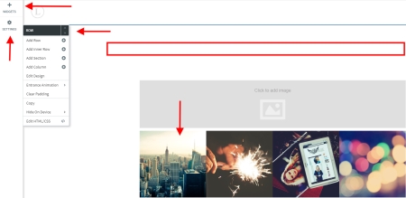
Next, let’s talk about the section creation tool. Sections you create are able to be saved for use with all websites on your account, which is quite the handy feature for developers. The creation process itself…not so much. Settings are split into five different pieces that are scattered throughout your editor:
- Widgets
- Overall section settings
- Row settings
- Row design settings
- Widget design settings
Duda set this up like their main design editor by placing the first two of these settings in the left sidebar, hiding the next two, and leaving the last available to you by clicking the widget in question. While I can give points one, two, and five a pass, I don’t understand why both parts of your row settings are so inconspicuous. I didn’t even find these critical tools until I went to explore the section creation tool!
The irony is not lost on me that a WYSIWYG with superior flexibility has somehow managed to portray itself as a clunky, unappealing exercise in frustration.
Moving on to Duda’s storefront options, I found a nicely organized dashboard that is far more intuitive that the main website editor. When you load it for the first time, the dashboard takes you on a quick tours that highlights the five setup steps to get your store up and running. You’ll also gain access to storefront widgets in the website editor that provide a handful of product layouts that are ideal for small to medium sized catalogs. If none fit your needs, you’re basically out of luck.
Once you’re up and running, the store dashboard is well equipped to help you manage basics like orders, customers, discounts, shipping, abandoned carts, and inventory. While there are also advanced features like Facebook integration and apps to cover a handful of niche needs, I would have rather seen a way for customers to toggle to local currencies or a product import tool that doesn’t stress the resources of Duda’s servers.
Duda also offers a blog feature, but it suffers from pretty severe limitations compared to the main design tools. Here are just a few I found:
- The editor can only handle single columns, meaning you can’t have image and text widgets in the same row
- There’s no category system, leaving you with no way to organize posts
- Image sizes are limited to a small handful of options
- You can only import posts from an RSS feed
- The blog does not offer its own font or text color selections, drawing instead from the global choices you pick for the whole site
No matter how I approach Duda’s editor, it just takes more time and effort to create a business website that comes up short of what I can build in WordPress. If anything, I’d say that Duda got their claim backwards. Between their hidden menus, inconsistent rules, and missing features, it’d take me twice as long to build a website on their platform with most of the features I want!
To get an idea of what I mean, you can watch Duda’s guide for editing pages in their dashboard. While they make it look easy, there’s a lot more to this process than meets the eye.
How accessible is Duda’s hosting platform? Rating – 4/10
No FTP or SSH access means no way to move your site away from Duda or take an external backup. Fortunately, Duda has a well organized internal backup system for you to use as you build and update your website. It offers up to 10 manual backups and 20 automatic backups for events such as publishing your site, entering Developer Mode to work with your code (more on this later), or even resetting your website.
The last one is an especially appreciated feature – I’ve talked with plenty of people who have reset their website by mistake or without fully realizing that doing so will erase all their content. My only real gripe with the internal backup system is that blog backups are managed in a separate section within your blog settings. Since you can’t export any part of your blog or website, I don’t really see the purpose in separating these backups from one another.
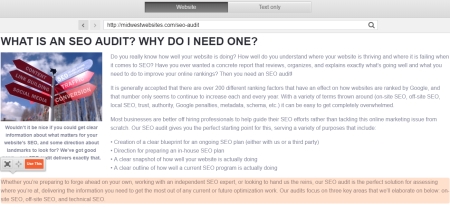
If you’re trying to move to Duda, however, they do have a content importer that looks for text and images on your existing site. Simply right click on the column, choose “Pull Content”, enter the website URL you’d like to import from, then move your cursor around the page until it highlights the section you’d like to copy.
This may still leave you the task of formatting what you import, but that is a relatively small complaint in the grand scheme of things. For those who struggle with copying and pasting text or have lost their original image files, this feature is nothing short of a godsend.
Developers can also request API access to create more customized designs. While this is a very helpful way to manage a portfolio of sites and expand upon Duda’s platform for your customers, I find myself asking why I would go to the trouble when it is easier to do more on a proper server with SSH access. Sure, you don’t have to go through the headaches of setting up or maintaining the server’s settings, but you also can’t adapt them if you need to either.
I raised this score from 3/10 to 4/10 during my October revisit to be consistent with other ratings I’ve given in this category.
How much of my content does Duda own? Rating – 0/10
Section 5 of Duda’s terms is very open-ended and gets uglier the further into it you read. Section b starts off innocently enough, stating that you give Duda license to use your content for promotions or operating the site on their servers, but they slip an “including but not limited to” clause that had me raising my eyebrows.
As I continued to read during my October revisit, I found that Duda also states they reserve the right to sell content you use with their services and personal information to third parties, you forfeit any intellectual property rights to this content without compensation, and Duda can continue to use your content as they see fit even after you delete it or stop being a customer.
They try to sweep these claims under the rug in section 6 by stating Duda does not own or claim ownership of your content, but with the liberties you give them in the earlier section, they don’t actually need to. I’ve never read terms of service that are so brazenly anti-customer and anti-developer. This is a complete deal-breaker for anybody that values ownership of their work, and grossly oversteps anything resembling reasonable boundaries.
Ending on a somewhat more positive note, most of the images Duda supplies to you can be used with both their services and external ones. The primary image provider you’ll run into issues with is Shutterstock, a company I’ve already stated my issues with in my Wix review. At least you can easily tell where you’re getting a stock image from in your editor, allowing you to avoid potential headaches if you do decide to surrender your content to Duda.
How friendly is Duda’s SEO design? Rating – 9/10
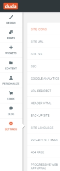 Most notes we like to see are here – header tags, SSL support, meta titles/descriptions, page URL customization, responsive design, alt tags, and URL redirects are all accounted for. Your site is hosted on Amazon’s cloud hosting, which is an extremely reputable hosting environment, and you can connect your own domain to Duda with relative ease. Best of all, none of these key settings were difficult to find.
Code for a Duda website seems a bit bloated and bulky, which is largely a symptom of their widget-focused design system. Critical pieces like text and header tags are still perfectly legible, but there’s an awful lot of extra fluff for a WYSIWYG that is predominantly built with HTML and CSS.
You do have the option to use a Duda subdomain when publishing, which reduces your score to a 8/10 should you use it. Subdomains you can’t control are bad for branding, can’t be moved should you change website providers (which resets any positive SEO authority/trust you’ve accumulated), and are a strike against your SEO. This score was lowered from 10/10 during my October revisit.
How easily can I integrate third party tools? Rating – 7/10
Your widgets offer you a few third party tools like including Google Maps, OpenTable reservations, Yelp reviews, and social media feeds tight off the bat. Those using Duda’s API can expand upon these offerings a bit further, but their documentation stresses this use is for localization.
HTML and CSS are fully accessible through a few different methods depending upon your needs. For smaller changes that are intended to be seen by your visitors, you can insert an HTML widget into your page. Don’t use this widget to manage elements like site analytics – there is a specific area in your general settings for Google Analytics and a header HTML section in each of your pages’ settings for tools that operate behind the scenes.
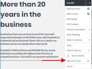
Existing widgets and columns can be managed by right clicking on them and choosing the “Edit HTML/CSS” option. This opens a popup window with all the code that composes their makeup, giving you free reign to do as you please. There’s also a shortcut to Developer Mode in the lower left corner, which will allow you to work with any element of your website’s code. This same level of access can be opened up by clicking the HTML icon in the upper right corner of your editor as well.
Since Developer Mode is this grand in scope, it should go without saying that it is intended for you to make larger code adjustments that require more coordination across a given page or your website as a whole. I’d recommend taking a moment to review their documentation for this feature if you’re new to coding, as this level of access makes it extremely easy to break your site if you aren’t careful.
Since so much of your mileage in this section will vary based upon your coding knowledge, I am basing my rating between that of an average user (6/10) and that of a developer (8/10). An average user isn’t going to want to take the time to learn these skills in most cases, and developers with the necessary coding knowledge will often prefer a hosting environment where they can work with some/all their server’s settings in addition to their website’s code.
What unique elements will I find with Duda? Overall Rating Adjustment – 0 points
Let’s start by talking about Duda’s support system. While their Help Center is well laid out, sometimes you need a bit more guidance to overcome a roadblock. If you’re working on your site during the business week, you can email their support team and get a response within 2-6 hours – assuming you email between 12:00 AM and 6:00 PM PST.
That’s right, no evening or weekend support. You know, the times a small business owner is most likely to find a couple hours to work on their website.
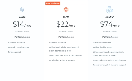
And these are just the discounted annual rates as of October 2018.
On its own, I could forgive this offense, but you also cannot use Duda’s phone or live chat support unless you are a part of their Pro program or are signed up for their Team, Agency, or Custom plans. When your basic website plan runs between $180-230 a year, skimping on support options for it looks both cheap and tacky – especially when e-commerce is extra.
There are some good points to note here as well. The first is the Site for Life option, which provides excellent value for a business putting up its first informational website. Just pay $300 for the responsive site platform, and it is yours indefinitely. This plan is not available for any site with a paid e-commerce add-on, but in all honesty, you can run a store more effectively elsewhere.
The second is a multilingual option, which creates copies of your website for customers that speak different languages. Many platforms lack a good conversion tool for this, which is great if you need to reach a wide variety of customers and cultures. The downside is that it uses Google Translate, which has a tendency to miss the mark more comically than most appreciate. Manual review is strongly advised before going live.
Our final feature of interest is actually geared toward those who have a functional desktop website elsewhere. Duda’s mobile-only websites turn the responsive editor’s import tool up to 11, pulling over as much of your full website as possible and setting it up on a mobile subdomain.
While the need for this has dwindled as responsive website design and accelerated mobile pages (AMP) have become standard, it’s still a cool feature for those who are behind the times, need a quick fix, and aren’t quite ready to rebuild their website.
Overall Rating – 5/10, plus a deal breaker. Do not use this platform for business websites.
While Duda has some noteworthy strengths in mobile editing and SEO, shaping their environment can be time consuming and their terms are an affront to their users’ intellectual property rights. If Duda was (or still is) on your list of web design candidates, we’ve got a better option for you.
Give us a call at 319-229-5225 or reach out through our contact form, and we’ll set up your business website in a WordPress environment that is with the times, excels in form and function, and is completely yours once it’s finished.

Braden is one of the founders of Midwest Websites, and has been professionally writing and developing websites for over 7 years. His blog posts often take an experience from his life and showcase lessons from it to help you maximize online presence for your business.

