
Today in our series of template-driven web design evaluations, we’ll be taking an in-depth look at Weebly, a popular provider that currently boasts between 40-50 million users depending on whom you ask. Founded in 2006 by 3 Penn State students, they spent their first year developing the platform and beta testing before launching their full interface in 2007. Since our initial review in February, they have been acquired by Square, which may result in some pronounced changes to their platform in the coming years.
Like many free and paid WYSIWYGs (What You See Is What You Get), Weebly claims to offer you and your business a beautiful website, complete with storefront that you can create with no coding knowledge. Unfortunately, providers of these rigidly structured platforms tend to showcase severe flaws when compared to professionally designed websites using WordPress.
While a general overview of these issues is available in our earlier Free vs Premium website post, this discussion is tailored to show you specific information about Weebly. Our overall score rests on a scale of 0-10, where 0 is directly harmful or useless for your website and 10 compares well to WordPress (our platform of choice).
This rating is composed of a 5 category review. Each point will be treated equally on the same 0-10 scale, then their average will be raised or lowered by unique elements that have an overall impact on user experience to determine the final result. For review, these areas are:
- Limitations on your website control
- The accessibility of your hosting platform
- How much content you own
- How friendly the SEO design is
- How easily you can use third party elements in your site
To give a proper analysis, we started a new website on weebly.com and took notes on what we discovered while building for our first time in their environment. Now it’s time to see what we found.
Jump ahead to:
How limited is Weebly’s website control? Rating – 5/10
Weebly doesn’t offer as wide a selection of themes as some providers, coming in with only a few dozen between its regular and storefront based designs. That in and of itself isn’t a big deal if you can fully customize your layout like Wix in the WYSIWYG editor. Unfortunately, this is not the case.
After selecting a theme, you’ll see some tools on the left you can use to drag and drop different block-based elements onto your page. Your primary page structure is composed of three options: sections, spacers, and dividers. Sections will be the meat and potatoes of any given page, taking up big areas that can have their own background and are designed for smaller block elements. Spacers add sections of empty space to a section, and dividers add similar space with a horizontal line.
From there, you can use the other drag and drop elements to form designs for each section. While this can provide improved flexibility over more rigid arrangements like GoDaddy’s GoCentral platform, Weebly’s execution of this concept has proven extremely convoluted and frustrating.

Remind me why we can’t just drag our mouse from the corner of the text box like civilized people?
Let’s use their text boxes as an example. When you drag a new text box over to your section, it takes up the full width of your section by default. While ideal in some places, there’s no clear way to have it take up a smaller area, like the right half of your section’s width. In order to do this, you need to drag a second text box to the left or right edge of the section until it highlights in a different color, then place the text box.
Now that you’ve done this, you get access to a little vertical divider. You can either click on this divider and drag it from left to right to increase or decrease a section’s width, or you can click on it and play with the spacing to set how far away from the divider your text is able to begin.
If I struggled to figure this nuance out, I can’t imagine how alienating this would be for someone building their first website. The amount of trial and error to get to this point was completely unreasonable.
Once I puzzled this particular mystery out, I tested the divider button a second time to see if there was a more intuitive way to create smaller text boxes. It was originally the first block I tried because it seemed like the correct tool for the job. After moving my cursor at a snail’s pace to get the left edge of my text box to highlight, I added it in only to receive a horizontal divider that covered the left half of my section. The top and bottom edges just added a new horizontal divider above or below my text box.

I went from unamused to actively annoyed at this point. The divider should be the obvious tool for this job, and it does nothing even remotely useful to complete the task I set for it. Surgical precision and the ability to find and jump through abstract hoops should never be expectations for any WYSIWYG – they’re specifically designed for novices!
Speaking of abstract hoops, let’s talk about the mobile version of Weebly sites for the moment. Unlike Wix, you have no ability to control elements of your mobile site. It just takes its best guess as to where things should go and hopes you like it. Sometimes you will, and other times it will rearrange text and images into a hideous monstrosity.
Since the mobile site isn’t trustworthy, you’ll want to check on it frequently during the design process or risk a LOT of backtracking. Don’t bother asking Weebly to fix issues with your mobile site either; they’re just going to tell you to rearrange your content. Frankly, I’d just use a better web design service to avoid this issue altogether.
Moving on to Weebly’s blogging tools, I found they use the same system as the rest of their WYSIWYG, meaning that you don’t have to reinvent the wheel to start arranging and writing blog posts. Everything you need to do this correctly is present, save for one element that we’re going to talk about later in the SEO section. My other complaint with the blog is fairly minor, and it is a symptom of a bigger issue I found within Weebly’s editor – button placements.
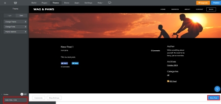
Who would think to look in these places?
When a user enters Weebly for the first time, they get used to the idea that the buttons they will need are going to be along either the top or left hand sides. Most platforms do this, so that makes sense. Why then, would you put critical buttons like the “New Post” button in the lower right hand corner? Nobody is going to intuitively look there for anything!
Another offender along this vein is the “Edit HTML/CSS” button in your theme settings. Rather than being in the upper portion of the left column of your screen, this button is hidden at the very bottom of that left column, hugging the border of your browser window.
As important as this button is going to be in your setup (again, more on this in the SEO section), why would you hide it?
While these obviously unfriendly user designs are baffling, there are some good points within Weebly’s system that are worth reviewing too. My favorite perk is the ease of changing themes; Weebly allows you to do this without forcing you to sacrifice your existing content. The process isn’t perfectly seamless, but a bit of reformatting is a small price to pay when compared to the prospect of starting your website over completely.
Apps are also cleverly handled by adding buttons to your existing button layout in the “Build” section of your editor. This ensures they will be easy to find and place after you invest the time to learn Weebly’s system, which is a welcome change of pace after the earlier hurdles.
If you’d like a brief visual overview of the Weebly editor and how it works, take a minute to check out their video below.
How accessible is Weebly’s hosting platform? Rating – 2/10
FTP and SSH access being unavailable is par for the course, so you won’t be modifying any hosting settings to improve your website’s capabilities. Ordinarily, this would also prevent you from backing up your website, but Weebly actually does allow you to download a zip file containing your website files! This will allow you to keep an offline copy of your content and even transplant it to another hosting provider – with a few caveats.
- You cannot retrieve blog posts because they are locked in Weebly’s database, which is not managed within their file system
- Features specific to Weebly like their contact form or slideshow tools may not work with other providers
- You cannot upload zip files back to Weebly
This tells me that Weebly’s WYSIWYG is designed using a structure similar to WordPress, but with an inferior backup option that will almost always be incomplete. The abilities to restore and transplant content are two of the primary reasons to back up a website, so while this is a nice effort, it definitely misses the mark.
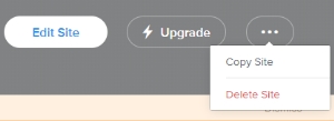
Onsite backup options are equally inadequate, requiring you to create an entirely separate copy of your website to serve as the “backup”. Wix and GoCentral both put this mediocre display to shame with their historical site recovery tools, leaving Weebly users with better alternatives across the board in this category. Still, these initiatives are more effort than many other WYSIWYGs have put forward, so I adjusted this rating from its original 1/10 during my October revisit to reflect this.
How much of my content does Weebly own? Rating – 3/10
You’ll want to check out section 7 of Weebly’s terms of use. While this is one of the nicer explanations for why you are giving them the right to do as they please with your content, that doesn’t change the fact that this clause can extend wildly beyond its intended use. I don’t remember seeing anything like this in their terms during my initial review, so I’m pretty disappointed to find it now.
Weebly does also stress that they do not claim ownership of your content, but this claim rings very hollowly when they later claim the right to use content transmitted to them by any means. Naturally this includes anything you put up on your website, as that content would be transmitted to their servers from your local computer.
Due to this disrespectful display toward the intellectual property of Weebly’s consumers, this score was lowered from a 7/10 to a 3/10 during my October revisit.
How unfriendly is Weebly’s SEO design? Rating – 7/10
Meta titles, meta descriptions, URL redirects, custom URLs, an SSL certificate, and responsive designs are all welcome things to see in Weebly’s settings. Alt tags are also present, though they’re a bit tricky to find in the image editor. You’ll need to scroll down, click “Advanced”, then type in the alt text field that you are provided.
Don’t bother looking for them in your header images though – these are treated as backgrounds for some unknown reason. You also cannot add an alt tag to your logo using Weebly’s editor, which is also perplexing. These problems are nothing compared to the issues I came across while trying to add header tags though.
If you want to insert header tags (h1, h2, etc.) into your Weebly website, you have two routes open to you. Title blocks will give you an h2 tag by default, but beyond that, you’re going to have to code each of them in. When your average user has never coded before, you’re asking for an impossible task AND damaging their SEO by setting your platform up this way.

No coding needed my ass.
Don’t get me wrong, I appreciate the ability to code in a WYSIWYG, but it should not be a mandatory component of the design process. Unfortunately, h1 tags are important enough to your SEO that you’re going to have to learn if you choose to go with Weebly’s service. This is especially important for blogging, as you’ll often need multiple header tags for each post to maximize their SEO benefits.
If you choose to use a free Weebly subdomain rather than one of your own choosing, this score is reduced to a 6/10. While I would normally penalize the unintuitive header tag system more severely, we’re about to discuss another option Weebly offers savvy novices to compensate for this glaring issue.
How easily can I integrate third party tools? Rating – 7/10
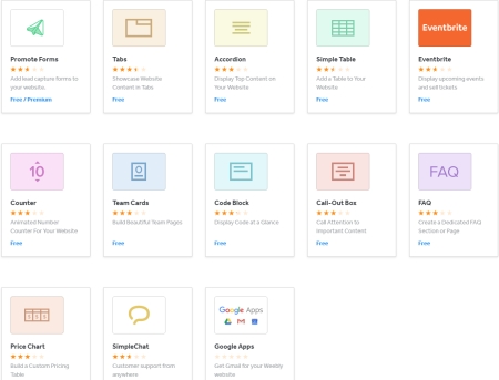 The saving grace for some of the flaws we’ve discussed up to this point can be found in the apps developed by third parties. Weebly has created several apps for their marketplace too, but they fail to exceed 3 stars out of 5 due to intermittent operation or lackluster features, with the exception of one that stands above its brethren at 3.5 stars.
This is not only embarrassing, but also a significant hurdle for the average customer. Apps are the only way most users will get anything resembling custom features for their website (such as h1 tags), so if a significant percentage don’t work properly, that cuts down on the opportunities for these companies to stand out online.
We aren’t even going to get into the discussion of why apps are being used as a placeholder for features that should be part of the main WYSIWYG package – that would be a full post on its own.
Despite Weebly’s “best” efforts, there are actually some pleasant surprises. Logo design, membership portals, industry tools and multilingual capabilities are just a few of the options that are available. Most of these robust apps do come with a price tag, meaning you will have to pay for each one you wish to use on your site.
Paywalls aren’t the only issue you’ll face on the app marketplace – the app page itself is also atrocious. Upon arrival, you are greeted by four categories of apps that dominate the page. My initial impression was that these represented all that was available, but in reality they only contain a small sample of your full options. This means that if you want to find the true gems, you’ll need to scroll further down the page to a SECOND organization system to truly browse Weebly’s apps.
I know I’ve harped on this a lot already, but this is yet another instance where Weebly shows they just don’t understand their target demographic.
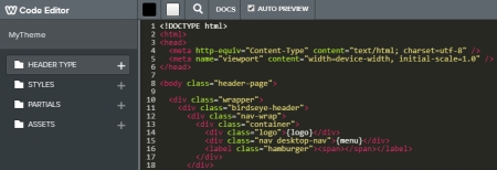
Now let’s talk coding capability. The “SEO Settings” button in the “Pages” section for each page gives you the ability to insert header and footer HTML for a given page, while the “Settings” section takes care of your Google Analytics and Webmaster Tools across your whole site. The ability to keep track of website data is critical, so I am glad to see options that cater to a variety of needs between these areas.
The HTML/CSS editor for your theme opens up considerable design flexibility for experienced developers, but between app issues, the inability to upload website files, and a lack of respect for intellectual integrity, I’ve already made a strong case for them to find a better environment.
What unique elements will I find with Weebly? Overall Rating Adjustment: -.3 points
Let’s start with the elephant in the room – paywalls. Weebly prides itself on providing a fully functional web design experience with their free plan options. I’d even say that its true, assuming you don’t need e-commerce, specialized functionality, phone support, the ability to use your own domain, the ability to avoid transaction fees, the ability to remove their ads…you get the idea.
Weebly is a company. Companies need to make money. I even expect a certain degree of “pay to play” with any freemium web design system, and do not object to this idea inherently. Many WordPress plugin and theme developers charge users for the ability to use their tools, and they haven’t ended the world as we know it by doing so.

Unfortunately, Google is where a lot of people will find Weebly. I’ve never needed a bigger asterisk to put next to the word “free.”
I do object to two things about the way Weebly handles this, however. The first is the fact that they literally advertise the ability to build a commerce website for free. Everywhere you turn during the web design process, they’re attempting to nickel and dime you for basic services like site statistics, transaction fees for commerce sites on their less expensive paid plans, and even the ability to remove their ads from your site (which are EXTREMELY intrusive on mobile devices).
The second is the need for paid apps without the guarantee you can use them elsewhere. I understand this requires some explanation, so allow me to elaborate.
As I mentioned earlier, Weebly’s current external backup system does not deliver a full backup experience. It tries to walk a line between what a CMS like WordPress can do while maintaining the rigid security of a WYSIWYG. Since WordPress has already demonstrated that moving paid content and backing up database content is possible, and Weebly’s interface appears to be an HTML variant of the same concept, I don’t understand why this roadblock has remained for as long as it has.
In short, paywalls like these would be nonissues if Weebly simply fixed these two things. Hopefully Square will pick up on this and make corrections within the next couple years.
Should you need support for your Weebly website, there are a few different routes you can take to get the assistance you require. App issues are handled by the development team that created the app, and all other issues can be resolved through chat, email support, help articles, or Weebly’s forums. The help articles and forums are both useful resources for a wide variety of issues, which is fortunate for more than the obvious reasons.
You see, Weebly also offers phone support 7 days a week, but it’s buried behind yet another paywall. The price this time is signing up for their Pro or Business plans, which I believe to be too steep. WYSIWYG customers frequently need a helping hand to begin with, and Weebly has compounded that need by creating convoluted routes for basic design features, I don’t see how this is anything but sleazy, leaving me to wonder if this demographic ignorance is actually just malevolent price gouging.
Overall Rating – 4.5/10
While we personally find the snap-to design of Weebly’s templates suffocating, their button placements perplexing, and their paywalls intrusive, there is no denying that the basic idea of their editor is extremely easy to understand. If you’re looking at putting together a placeholder website until you can bring on a web developer, you could certainly do worse. Anything more complicated and you will be much better served elsewhere.
If you’ve already arrived at that point, I’ve got good news – we’ve got you covered! Just call 319-229-5225 or fill out our contact form here, and we’ll be happy to talk to you about your business goals so we can design an online solution that is right for you.

Braden is one of the founders of Midwest Websites, and has been professionally writing and developing websites for over 7 years. His blog posts often take an experience from his life and showcase lessons from it to help you maximize online presence for your business.
